Government Enterprise Licensing and Permit Product
SaaS licensing application I work on daily. I can't share names or any specifics about the project but I'll share my thoughts, design, and research processes.
I work in an agile software development environment using the 'scrum' framework/methodology. This project had 3 agile development delivery teams and 3 members of a product team. I sat on the product team.

Most of the preliminary research had been completed before I joined the team. However, there was a lot of information to disect from a research perspective. User interviews had been carried out and from analysis the users had been utilizing a paper process to collect and process license applications.
Journey maps had been created and recommendations based on the findings were also complete.
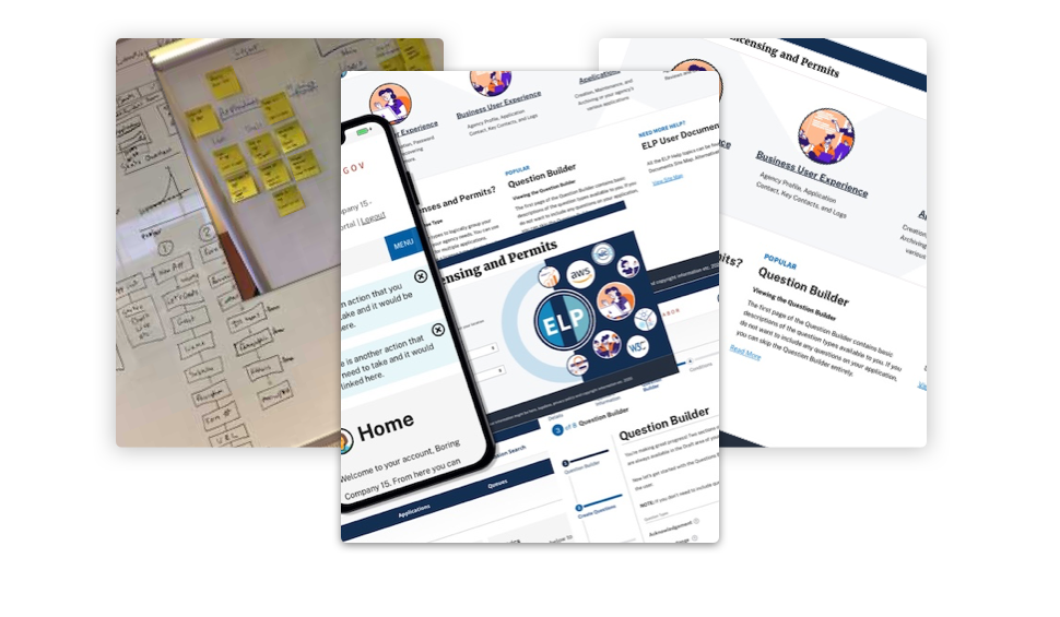
Not worried about look or style just yet, I put together several different flows to accomplish each of the various tasks that were assigned. I'd iterate through those with the Business Analyst and PO until we were all happy.
While learning and understanding the application building process, I'd come up with several low and high fidelity mockups to help guide the user. Then, I'd move on to a base html/css template such as Bootstrap, Foundation, or Material to ensure the mockups had some familiarity. While I was working on these screens the QA department would be vetting the various templates out there for accessibility, cost, and various other business requirements.
We first tackled the agency side of the application as this is the most complex part of the process. We had a requirement for a 'wizard' to help the agencies build their forms cleanly and keep naming convention standards the same across all forms and tenants. We had persona's for agency administrators, with only the basic experience of a word processing application so it had to be intuitive.
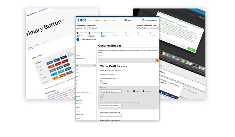
The most complex parts of the form builder is the question builder and the logic controls. Agencies need to be able to build their own questions for constituents. Questions need to be reorganized, made required and have instructions added. Once they have questions built, some logic might need to be added. For example, when a choice is made from a multiple choice question it needs to reveal or hide additional questions for the constituent.

Once an agency has created a form there's a whole new set of considerations. How does the agency publish their form, how does an agency manage forms and users, test draft forms, collect payments, run analytics/metrics, what about custom fields, agency help, accessibility, responsive design. The list goes on. All these sections were again broken down into flows and mockups as we worked through the process.
As all the items above were considered I made some decisions on the template, started on the design system and style guide for the application.
Next up was the constituent user. How would they interact with the form? It needs to be fast, responsive and easy to use. From our research, mobile users make up approximately 75% of visitors to our public websites so that was my first priority. Mobile first is about designing, developing and marketing for a great mobile experience first and then scaling this up so whatever device the audience is using they always get a great experience and impression.
Now that we're happy with how the agency builds the form and how the constituent uses the form, its time to test it. We ran several user feedback sessions and made the necessary text updates and flow tweaks. As with every user feedback session, eyes were opened to missing flow pieces, confusing instructions and unusual questions from users. Several of the sessions called for tool tips to be added to the form builder and retested with those users.
After some particularly interesting quantitative data was analyzed we started a process of introducing the user to a complex part of the application build. The idea was to encourage the user to actually read the instructions presented to them. Many of the user feedback sessions revealed that the users ignored the instructions and started clicking around.

While the user feedback sessions were happening, I started working on the help and search screens for the agency. Security were then brought in for login flows, password requirements, security questions etc. and those screens were also put together.
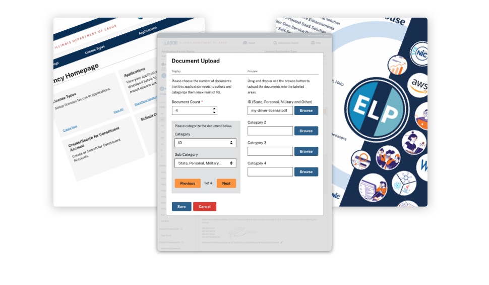
Finally the form builder itself. Those included some of the dashboard screens, form management, question and logic builders, as well as a drag and drop form creation process. I've highlighted several of the configuration and preview screens as part of adding form components. Those are shown on this page.
As is with most projects I wanted to include some user feedback. Unfortunately we were not able to user test every sprint so I proceeded to conduct moderated user testing sessions at the end of every deliverable. The users were representative of the actual user base, the sessions were recorded, I collated my findings and produced a report. As with most user feedback sessions there were lots of eye opening events. A couple I wanted to mention as part of my feedback were.
- Nobody reads anything! - Several of the users didn't read the instructions at the top of each page at all and just tried to guess their way through the application creation.
- Lets get the errors first! - One of the users loaded a form created in the application and rather than figure out what was required on the form they just clicked submit first! This let the user figure out the required items on the page because they all turned red. That way, they just filled out what was "red". That was a new one on me.
I then produced a report with some specific usability/accessibility suggestions, ranked them and even produced some screens in Invision to illustrate the suggestions.
The report was produced using the usability.gov test report template.

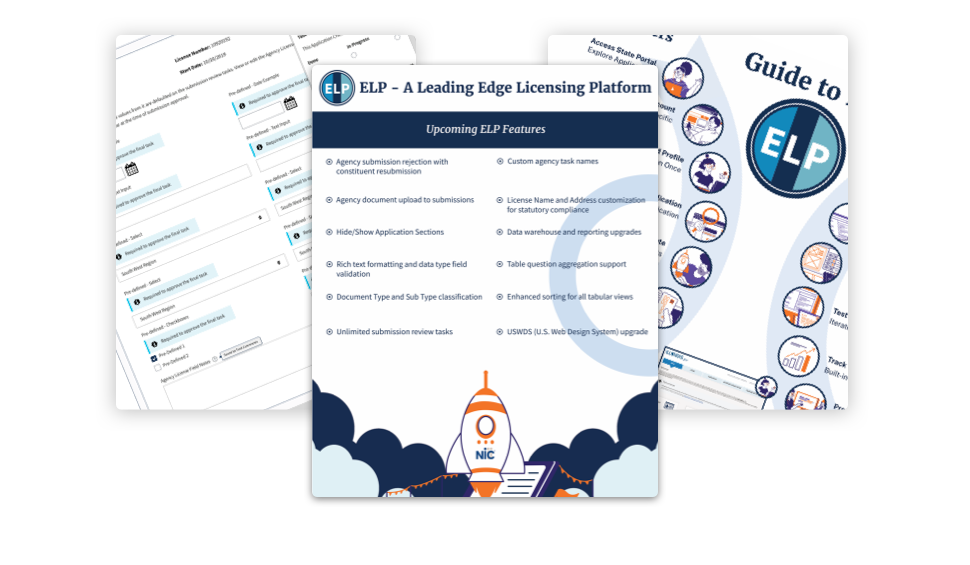
The next part of this project that I'm working on currently is introducing new form elements, renewals, document work flow, multi-tenant setup process and a complex fee collection option. If you made it this far, thank you for taking the time to read through my process.
Return to portfolio page
