Proximity Learning
Web app for teachers, districts, and administrators to manage the complex process of online learning.
In February of 2023 I took on some part time remote contractual work for Proxmity Learning. Proximity Learning connects all learners with the expert teachers they deserve. By connecting students with teachers, they increase educational equity, meaning that every child receives what they need to develop to their potential. My role specifically was UI design and due to my limited availability, product would act as the middle man between me and development. This wasn't alway the case, I spoke to development many times but this worked for us in this instance. I believe as a UX representative you have to be flexible in your approach to any project. Understand the needs of your client and users.

In the first couple of weeks working with the team we reviewed the personas, mood boards and user journeys that product and marketing had put together. They already had a basic branding and font stack in place so I set about coming up with some design concepts for their website application. This would be a 2.0 of their online web app but I purposely didn't spend much time at the current site in order to follow the product needs and user research presented to me.
After a few iterations we settled on a design and started putting together the pages. The onboarding of districts and teachers is incredibly complex. We had to take into consideration managing certifications, class room requirements, pay, courses, and scheduling which are just a few of about 20 data points. We had to break everything into manageable chunks then figure out how to merge and manage the data.

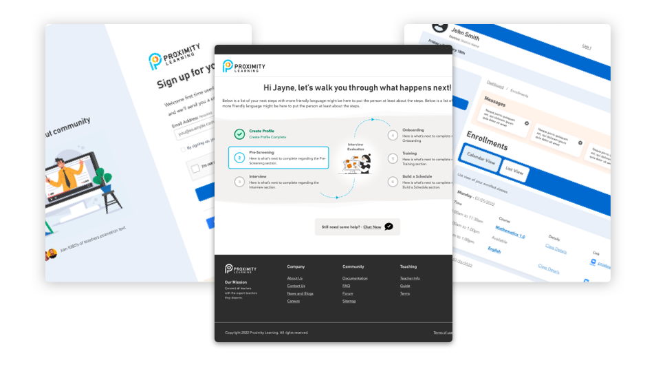
We first tackled the sign up and login process. It was determined by stakeholders that the rollout of phase 1 of version 2 of the application would start there. My designs were signed off on and handed over to development.
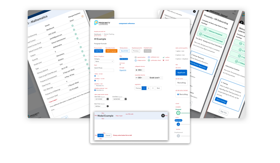
While dev was digesting and working on the signup and login process I started putting together the component list. Slowly at first with text specifics, form elements, and notifications. Then I moved on to header/footer and modal layouts.

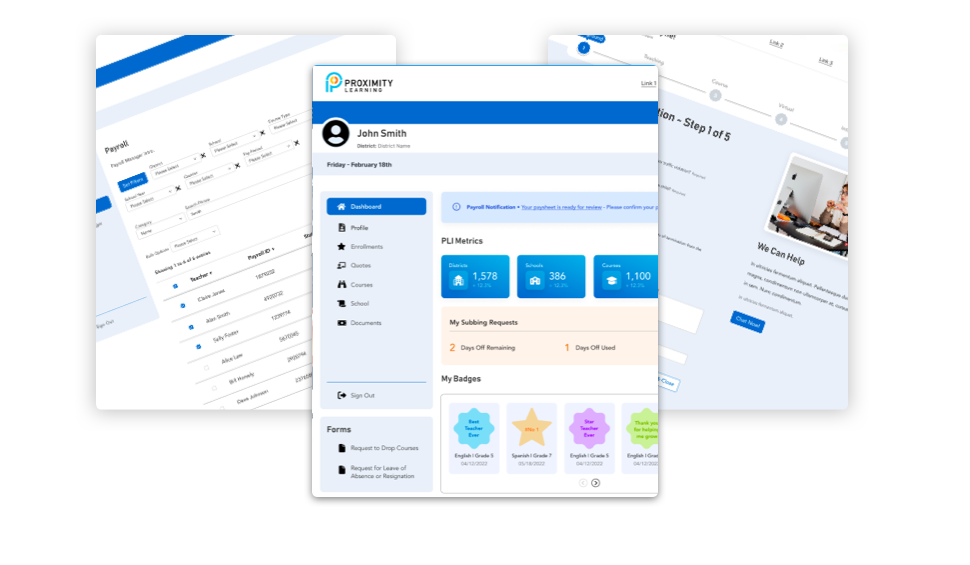
In the months that followed we put together desktop and mobile layouts for system messages, administration screens, roles and permissions, teacher management and so on. Product lead customer feedback sessions from teachers and students in order to hone in on the specific wants and needs. We had many meetings on the feedback and tweaked the screens to accommodate their wants and needs.
This project is far from over but currently Proxlearn have determined they're happy with the progress and are in a maintenance mode for their internal applications at this time.
Return to portfolio page
